Adobe Illustrator Practice
- Oct 8, 2018
- 1 min read

KEY WORDS
Image Tracing
Overlap
Contrasting Colour
Fluorescence Colour
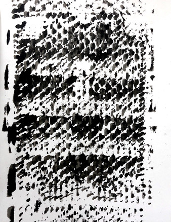
Original Pictures
These three pictures were what I done in the Mark Making Project.
1

As an experiment, the first one that I tried is barely tracing the original image and copied it. Then, I reduced the transparency of the copied one and I thought that light green has a wonderful collaboration with pink.
2

For the second trial, I was trying to make the picture more 3D-like. Therefore, based on the first image, I added a flourescent green as the background to accentuate the contrast.
3

For the third picture, I did two backgrounds, pink and green, for emphasize the contrasting colour and mix with the pattern respectively. The reason why I used orange is developing a medium layer to separate the pattern (green) and background.
4
By the inspiration of pop-art style, I applied two strongly contrasting colour for highlight the texture within the picture and then I switched the colours to see the different effect.
Evaluation
I think the functions of AI are obviously abundant, so that I need more time for learning them. Generally, I am happy on what I made out because the contrasting colour amused me a lot. However, how to crop the canvas and use the layers are the questions that I still have to find out.


Comments