Structure
- Jan 3, 2019
- 35 min read
Updated: Mar 7, 2019
Brain Storm
"Structure" is a rather general topic because it seems like covering everything in our daily life.

In the beginning, I did a brain storm to roughly review what does the structure means to me most. As for me, it could be the design and architecture that we may use everyday. It also could be the blood relationship, social stratums and man-made ecological structure. In the art respect, it reminded me the abstract art, Bauhaus, De Stijl, Constructivism and Suprematism. There was Taoist terminology always repeating in my mind while I thinking the meaning of structure. In the Tao Te Ching, Lao Zi described that the greatest form is formless, which really inspired me and let me think of a work that I did nearly three years ago. Its name was Form and Formless. Despite the "structure" gave me a concrete, even in the art aspect, I believe as Lao ZI said, the structure that I want to pursue should be existing in the abstraction. Through these years, I was still thinking about it because I felt that it was not finished yet, somehow it was lacking of something. Therefore, I planned to eventually express what I wanted to say based on the study of this project.


Form and Formlessness, 2017
What is STRUCTURE?
As what I use to do in the beginning of a topic, I researched the literal meaning of "structure" on Wikipedia.

General Definition
"Structure is an arrangement and organisation of interrelated elements in a material object or system, or the object or system so organised. Material structures include man-made objects such as buildings and machines and natural objects such as biological organisms, minerals and chemicals. Abstract structures include data structures in computer science and musical form. Types of structure include a hierarchy (a cascade of one-to-many relationships), a network featuring many-to-many links, or a lattice featuring connections between components that are neighbours in space."
Trip of Winchester
Thus, structure has diverse meanings that apply in different subjects. In December 18th, I went to Winchester, it was my first time to carefully look at the Western architecture. I found that the structure in the buildings were complex and delicate, which included physics, mechanics, aesthetics and geometrics.


The geometric symmetry was really attracting me. Meanwhile, based on this trip, I realised that both Eastern and Western architectures were merging the physical symbolism and spiritual ideal together. The structure of the cathedral was serving for the religious doctrine, the magnificent building constructed a solemn atmosphere for the holiness. Same as the art, the physical appearance usually bridged audience and the conceptual core.
The Exhibitions
Saatchi Galley/ Wellcome Collection/ Science Museum/ Hayward Gallery
In December 22nd, I went to several exhibitions, which respectively were "Living With Buildings - Health & Architecture" (Wellcome Collection), "The Sun - Living With Our Star" (Science Museum), "Black Mirror: Art as Social Satire" (Saatchi Gallery) and "Space Shifters" (Hayward Gallery), trying to find the connection with structure.


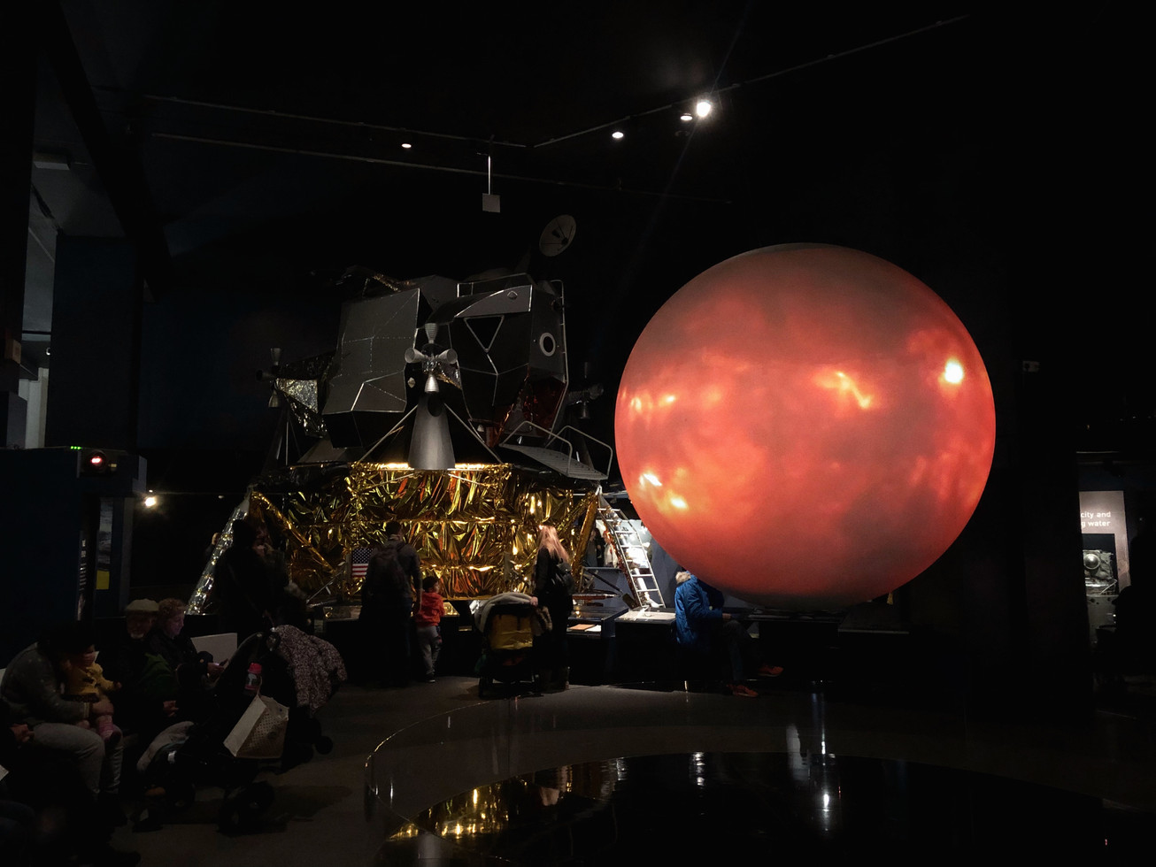


Interestingly, from the architecture to fine art, from fine art to the photos that I took were all following the guide of "structure". Lines and shapes constructed the feature. In another word, we are sensitive to the "structure" because the order of the shapes is covering nearly everything in our life. From this point to think, perhaps what the greatest form that Lao Zi said would be the detachment of the shape.
Whitechapel Gallery
In January 4th, I went to the Whitechapel Gallery because the some of the exhibitions in it were quite attracting me. At that time, there were six exhibitions in total were showing, which were "Elmgreen & Dragset: This Is How We Bite Our Tongue", "Ulla von Brandenburg: Sweet Feast, In partnership with Le Prix Marcel Duchamp", "Surreal Science: Loudon Collection with Salvatore Arancio", "Staging Jackson Pollock", "Mikhail Karikis: No Ordinary Protest", and the first one interested me most.


On account of the exhibition was about only two artists who worked together, I could clearly feel the "structure" of their ideas which embodying in the works that had explicit topics, about politics, homosexuality, social issues. Meanwhile, these works somewhat revealed out a part of the structure of this society, such as the most noticeable The Whitechapel Pool, which was talking about the gentrification and civic space.
Art: 21 "Structures"

This was the documentary that recommended by tutors, which interviewed several famous artists to share their understanding of "structure" based on talking about their works.
It was really interesting and the most appealing point was that I can see how these artists progressed their thought and realised the idea to a physical artwork. I noted down some quotes that really intriguing to me.
Mathew Ritchie

We're all trying to advance; at least to question what's going on.
Drawing, infinite machine, keep pushing, "transcribing"
Part of the work is letting people in.
(Mathew's son) All he's getting is this just insane, confusing information, and that process keeps continuing all our lives. So we filter out, you know, the knowledge that everything in this space has a meaning and a history and a story.
Lines, drawing, world, universe, prison
So, in a way, each of us is in kind of our own prison, like it bring with you. It's a prison of your biology of your social structure, of your life, and how that is both a sort of challenge and an opportunity.
Everything in the material world around us has a narrative. So, to sort of classify visual art alone, as the one medium that shouldn't require any effort on behalf of anybody to ever understand it -- you should just be able to look at it and walk away as a pure sensation -- that relegates it to the level like a roller coaster ride. Like "Just shut your eyes and enjoy the ride." (for art, open your eyes)
Fred Wilson

As I get older, I realised that your identity is really tied largely to your experiences and the time period that you grew up.
All these representations that I grew up with are telling me who I am whether I realise it or not.
Richard Tuttle

In any art form, these has to be an accounting of its opposite condition. You're going to be a visual artist, then there has to be something in it that accounts for the possibility of the invisible, the opposite of the visual experience.
A painting or a sculpture really exists somewhere between what it is and what it is not.
Everything in life is drawing, if you want, and drawing is absolutely quintessential to knowing the self, you know, and I would even say that the art that survive, you know, from one generation to the next, is the art that actually carries something that tells us, tells society what about self.
Well, what about making drawings about an area where you can't see?
Sometimes the art is actually in the tenth one, you know the final one, and other times, it's in the whole ten.
Roni Horn
Unknown is where I want to be, I don't want distinguished.
Summary
I was really happy to find out that some of my ideas were quite similar as these artists. Mathew Ritchie mentioned about the interaction between the work and the viewer and the idea of we were prisoned in this structured world, which was resembling the Buddhist philosophy. For Fred Wilson, I agreed with the influence of the milieu where you grew up, because I also could feel an ambiguous impression of the childhood, which would constantly appear in my mind. In the whole documentary, Richard Tuttle and Roni Horn were the two artists who inspired my most, and Horn's enlightenment had already been put in the Illusiveness. To talk about Tuttle's ideas, I also could perceive the similarity between them and Taoist philosophy, which mentioned everything was relatively existing; therefore, same as the visual art, the existence of it also relying on the invisible thing. Coincidently, I found that his question, "Well, what about making drawings about an area where you can't see?", was just corresponding to this project. I was also thinking about a way to present the invisible "emptiness". Thus, his words were really moving.
Plan of The Research
On account of I had finished the study of the previous work, I would be more clear on the conceptual point that I attempted to attain. Thus, in the secondary research, I will follow the idea that I mentioned above, to concentrate on the research of how the bygone art movements dealt with the structure and why did they do this way, and also the further study of Taoism and Buddhism to support the conceptual part as well as the Chinese artists who did the relating artworks.
The art movements in the list are what I had mentioned above, including abstract art, Bauhaus, De Stijl, Constructivism and Suprematism. I will generally look the development and the main principle of each, and select some artists to specifically study.

Research
Abstract Art: Explanation of Tate
"Abstract art is art that does not attempt to represent an accurate depiction of a visual reality but instead use shapes, colours, forms and gestural marks to achieve its effect.
Strictly speaking, the word abstract means to separate or withdraw something from something else.
The term can be applied to art that is based an object, figure or landscape, where forms have been simplified or schematised.
It is also applied to art that uses forms, such as geometric shapes or gestural marks, which have no source at all in an external visual reality. Some artists of this ‘pure’ abstraction have preferred terms such as concrete art or non-objective art, but in practice the word abstract is used across the board and the distinction between the two is not always obvious.
Abstract art is often seen as carrying a moral dimension, in that it can be seen to stand for virtues such as order, purity, simplicity and spirituality.
Since the early 1900s, abstract art has formed a central stream of modern art."
In Tate's explanation of abstract art, "concrete art" and "non-objective art" are relating terms that I noticed. I would continue to look up this two terms later.

I also got some informations from the description of Wikipedia. For the history part, I realised that the abstract art actually has been existing for a long time that can be traced back to primitive times that people used lines and shapes to symbolising a pattern, even the totem of a tribe. However, after the Western art experienced the Renaissance, people used more logical view to regard the art and advocated to achieve the effect of verisimilitude.

Until the end of the 19th century, while the industry and social system were happening the earthshaking changes, people started to think of getting the rid of the traditional painting. The new milieu changed people's idea of art again, and gradually turning back to the abstract.
For the explanation part, I realised that the so-called realistic art is still containing the abstract part. Therefore, in the text it also explained that, "total abstraction bears no trace of any reference to anything recognisable", the abstract art is often personal and elusive.
Meanwhile, it was really helpful that the text also provided an development route of the abstract art as well as the relating artists.
Post Impressionism:
Paul Gauguin, Georges Seurat, Vincent van Gogh and Paul Cézanne had an enormous impact on 20th-century art and led to the advent of 20th-century abstraction.


Fauvism:
At the beginning of the 20th century Henri Matisse and several other young artists including the pre-cubist Georges Braque, André Derain, Raoul Dufy and Maurice de Vlaminck.


The raw language of color as developed by the Fauves directly influenced another pioneer of abstraction, Wassily Kandinsky.

Cubism:
Pablo Picasso made his first cubist paintings based on Cézanne's idea that all depiction of nature can be reduced to three solids: cube, sphere and cone.
Analytic cubism:
Pablo Picasso and Georges Braque, from about 1908 through 1912.


Synthetic cubism:
Braque, Picasso, Fernand Léger, Juan Gris, Albert Gleizes, Marcel Duchamp and others into the 1920s.


Dada:
The collage artists like Kurt Schwitters and Man Ray and others taking the clue from Cubism were instrumental to the development of the movement called Dada.


The Rayist (Luchizm):
Natalia Goncharova and Mikhail Lariono


Suprematism:
Kasimir Malevich, Black Square, in 1915.

Architectonic Constructions and Spatial Force Constructions
Liubov Popova, created between 1916 and 1921.


Neo-Plasticism:
Piet Mondrian, between 1915 and 1919

Summary
This overview is beneficial for me to further understand the styles of each art movement and the representing artists. Based on this small research, I find that the Neo-Plasticism, Concrete art, Non-objective art are also intriguing for me. So in the following research, I will specifically look at Bauhaus (1919), De Stijl (1917), Constructivism (1915), Suprematism (1913), Neo-Plasticism (1917), Concrete art (1930), Constructionism (1950) and Non-objective art, then set the artist list to study.
Non-objective Art: Detach from the reality
It is a quite general term and the idea of it was firstly used by the Russian Constructivist Alexander Rodchenko, who titled some of his works with "Non-Objective Painting". At the same time, the artists like Wassily Kandinsky and Kasimir Malevich were also exploring the way of getting rid of the figurative references on the picture.


In the description of Tate, "it and was inspired by the Greek philosopher Plato who believed that geometry was the highest form of beauty"; therefore, the artists such as Kandinsky was trying to express the non-material things like music in his work. In the article The Birth of Non-Objective Painting by Artsy.com, it mainly introduced the influence of Kandinsky and there is a sentence described his change of style after knowing the disintegration of the atom, it says, "for him it also suggested art should be concerned with the mystical, the metaphysical and the spiritual." While people were understanding more about this world, the uncertainty was also generating simultaneously. The rise of either abstract art or non-objective art was reflecting the impact of the tremendous change of technology, people felt that the world was still far different than what they used to think was. At that moment, the metaphysical or spiritual things were the most "steady" harbour for people to view back to the internal world, did not reck any external materials.
Through the study of it, I realised that the non-objective art was a quite general term which described the artworks that attempting to detach from the references of reality.
Suprematism: Rectangles, Squares and Circles (1913-late 1920s)

The Suprematism would be one of the most representative non-figurative art form which was led by the Russian artist Kasimir Malevich.

In 1927, he published a book called The Non-Objective World which stated the Suprematism was trying to "free art from the dead weight of the real world" and mainly using the basic geometric forms, such as rectangles, circles and squares with beautiful colours. In addition, Malevich described three levels of the Suprematism, which were black, coloured and white. Meanwhile, the white colour usually was the background of the picture which creates the feeling of colour in space. Malevich believed that the Suprematist art would be ever superior than the previous arts and he was pursuing the "supremacy of pure feeling or perception in the pictorial arts", which led it more like the metaphysical or mystical study at that time.

"Just as Futurism aimed at a total renewal of Russian culture, so Suprematism claimed to supersede all art movements that had gone before it."
theartstory.org


"Suprematist abstract painting was aimed at doing much the same, by removing the real world entirely and leaving the viewer to contemplate what kind of picture of the world is offered by, for instance, a Black Square (c. 1915)."
theartstory.org


"We see that Suprematism has swept away from the plane the illusions of two-dimensional planimetric space, the illusions of three-dimensional perspective space, and has created the ultimate illusion of irrational space, with its infinite extensibility into the background and foreground."
El Lissitzky
Constructivism: "Practicality married beauty" (1915-late 1930s)

Constructivism was the last influential modern art movement in the 20th century's Russia, which was founded by Vladimir Tatlin and Alexander Rodchenko around 1915. Inspired by Picasso's cubist constructions, Tatlin decided to use the industrial materials to create the complete abstract art. The name of Constructivism was created in 1921 and in 1923, the manifesto of it defined as, "Constructivism is a purely technical mastery and organisation of materials". The Constructivism also absorbed from Suprematism and Futurism, but claimed to serve for the social purpose and accentuated the connection between "practicality" and "beauty". It was the spontaneous evolution of the definition of art while the change of society happening, which echoing the establishment of "modern". As the article in theartstory.org described, "Tatlin suggests that modernity and experiment should be Russia's new gods", the revolution happened in Russia was profoundly influenced the Constructivism.
This video helped me to further understand the reason why did Constructivism generated based on that social circumstance in both international and domestic ranges
.

"For many Constructivists, this entailed an ethic of 'truth to materials,' the belief that materials should be employed only in accordance with their capacities, and in such a way that demonstrated the uses to which they could be put."
theartstory.org
I am attracted by the abstract effects that created by the materials, the structures of them are visually amusing. Especially Naum Gabo's sculptures are somewhat fitting with my expecting effect of the three-dimensional version of my work. Therefore, later I would continue to research more about his ideas and artworks.


De Stijl: The basic basis of art (1917-1931)


De Stijl was an art group that founded by Piet Mondrian (1872–1944) and Theo van Doesburg (1883–1931) in 1917 and promoted using geometric forms and primary colours. "De Stijl" was named by Mondrian, which in Dutch means "style", as for him, "he defined his aims and used, perhaps for the first time, the term neo-plasticism." (theartstory.org) This movement not only influenced the fine art, but also applied their motif in product design and architecture. The De Stijl artists expected to create "a universal visual language appropriate to the modern era, a time of a new, spiritualized world order" (ibid.), which was largely influenced by the World War I to create a utopian art form. Therefore, the primary colours, black, grey and white as well as the horizontal, vertial and diagonal lines were playing the main role in this movement. For the architecture part, it inspired the Bauhaus-inspired International Style. For the fine art part, with following many abstract art movements, it continued on exploring the way of prohibiting the connection with any objective representation.


About the end of Theo van Doesburg's life, he reduced the colours from the canvas and barely left black, white and a bit of grey on it (Left side, Arithmetic Composition, 1929-30).
"We speak of concrete and not abstract painting because nothing is more concrete, more real than a line, a color, a surface."
Theo van Doesburg

From Doesburg's words, I guess that the concrete art may be an art term as well. The concrete art probably is defined by its use of simply geometric structures. With the same idea, I realised that the "neo-plasticism" was an idea or a term that may also relating to the geometric structure and restrictive use of colours.

The Rietveld Schröder House is the only building that built according to the principle of De Stijl. The theartstory.org described that "Rietveld's design makes no attempt to interact with any of the surrounding buildings or roadways, suggesting its presence as an isolated structure focusing inward instead of outward." Based on the description, I am inspired that as the art movements that researched above, all these which were generated around the period of WWI turned their attentions from the external world to the inside. They all attempted to cancel the link with the outside world in the artworks and pursuing the ultimate "language" of art.
Neo-Plasticism: Established on the absolute orders (1917-1944)

Neo-plasticism is a term used by De Stijl, especially, Piet Mondrian, for his own type of abstract painting that using horizontal and vertical lines and primary colours to express the universal truth in the balanced compositions.

From 1909-1910 Mondrian studied Georges Seurat's colour theory that focused on the use of contrasting primary colours and also joined the Dutch Theosophical Society which profoundly inspired him on the establishment of Neo-Plasticism principle. M. H. J. Schoenmaekers's Beginselen der Beeldende Wiskunde (The Principles of Plastic Mathematics) influenced him most and we can see the prototypical reference from Schoenmaekers's words, that already mentioned the lines and primary colours:
"The two fundamental and absolute extremes that shape our planet are: on the one hand the line of the horizontal force, namely the trajectory of the Earth around the Sun, and on the other vertical and essentially spatial movement of the rays that issue from the center of the Sun...the three essential colors are yellow, blue, and red."
Meanwhile, Schoenmaeker's another phrases, "de nieuwe beelding," which spontaneously became as the name of this art type, which means "new image creation" or "new art."

As for Mondrian, he applied this idea into value of life and believing that these fundamental elements were the truths that he wanted to pursue, "Vertical and horizontal lines are the expression of two opposing forces; they exist everywhere and dominate everything; their reciprocal action constitutes 'life'."

Therefore, not only Mondrian but also the artists in the De Stijl circle before 1923 when he left the circle were following this doctrine, using the primary colours of red, yellow, and blue against the non-colours of black, white, and grey to produce equilibrium.
"Neo-plasticism was in fact an ideal art in which the basic elements of painting – colour, line form – were used only in their purest, most fundamental state: only primary colours and non-colours, only squares and rectangles, only straight and horizontal or vertical lines."
Tate
"Neo-Plasticism creates harmony through two extremes: the universal and the individual. The former by revelation, the latter by deduction."
Piet Mondrian

In 1923, Mondrian seceded from the De Stijl group because of the contradiction between him and van Doesburg. Through van Duesburg's paintings we can see that he usually presented a bolshy attitude to the Neo-Plasticism. He did not always apply the vertical and horizontal lines, and the balanced composition on the canvas. As for me, Mondrian gave me a kind of devout sense that he firmly believed in his philosophy, and practising it unswervingly; whereas van Doesburg was more bold to add new ideas in the painting. Comparing to Doesburg, Mondrian was more like a believer. However, in the Victory Boogie Woogie (1942-1944), Mondrian's unfinished work before him dead, I can see the more sophisticate and agile emotion.

Bauhaus: Re-make the art education (1919-1933)

The Bauhaus was one of the most influential modernist art school as well as a zeitgeist that profoundly inspired numerous artists. The name of it was actually the inversion of a German word, "Hausbau", which means "house of building", to demonstrate the difference between the traditional art school. It was founded in 1919 in Weimar, Germany by the architect Walter Gropius.
"The origins of the Bauhaus lie in the late 19th century, in anxieties about the soullessness of modern manufacturing, and fears about art's loss of social relevance. The Bauhaus aimed reunite fine art and functional design, creating practical objects with the soul of artworks."
"Although the Bauhaus abandoned many aspects of traditional fine-arts education, it was deeply concerned with intellectual and theoretical approaches to its subject. Various aspects of artistic and design pedagogy were fused, and the hierarchy of the arts which had stood in place during the Renaissance was levelled out: the practical crafts - architecture and interior design, textiles and woodwork - were placed on a par with fine arts such as sculpture and painting."
theartstory.org
Meanwhile, the development of Russian Constructivism in the 1910s was also indispensably influenced the emerge of Bauhaus because it provided an actual example of combining the practicality with the art. Therefore, the study of art in Bauhaus was more leaning to the science instead of the humanities. It also reminded me the works of Duchamp, which also concerning more about the industrial materials and scientific study.
Through the research, I found many appealing ideas behind the artist's works.

After Kandinsky returned to Germany in 1922, he began to teach in the Bauhaus. In 1923, he wanted to further discover the relationship between the particular shapes and colours, thereby he made a questionnaire to let the people coloured the apposite colour they believed for a triangle, square and circle. Eventually, the yellow triangle, red square and blue circle were the most common answers, which became as one of the motif of Bauhaus as well as embodied in this work. I am wondering why did people commonly selected the primary colours as the answer or were they the only three selections.

In the analysis of the Bauhaus building in
Dessau, which designed by the first Bauhaus' principle, Walter Gropius, I somewhat understood the education idea of him.
"The succession of changing perspectives which the building affords reflected Gropius's vision for social evolution: for the emergence of a more egalitarian, rational, orderly culture. "
theartstory.org

In the research of Bauhaus, I surprisingly found the artworks of Moholy-Nagy were really inspring. They gathered the memory of Marcel Duchamp, Man Ray and Ai Weiwei together, which I believe he works are avant-garde and intriguing.
"The innovative use of modern materials to create the work, which was initially intended for commercial use in theatres, epitomises the Bauhaus emphasis on mass production, the machine aesthetic, and the use of modern technology to make works of functional art."
ibid.
For this work, on the material way it made me think of Duchamp's mechanic-structure artworks, such as his Rotary Demisphere (1925). Both of them were using the machines to create something visually attractive. On the idea part, the word "mass production" really attracts me because it reminds me Ai Weiwei's Sunflower Seeds (2010), which also talked about this issue. However, crossing nearly a century, this topic is still argued amongst people, which could prove that the Bauhaus' idea was edge-cutting.
"Light Prop for an Electric Stage exemplifies this philosophy: Moholy-Nagy felt that its use of motion and time-bound light-patterns - dependent upon the viewer to create their own unique, narrative experience of the work - would transform his audience from passive recipients into active participants within an immersive creative environment. "
After researching, I realised that Moholy-Nagy used to make a film about this work, called A Lightplay : Black White Grey, which recorded the movement of this machine under the pure black-and-white situation. Comparing to the videos that recorded in the normal environment and light, I found the difference of this video and the meaning of the "immersive creative environment". In this video, the movements were not simply mechanical, the contrast of light and shadow as well as the dreamy feeling literally constructed an immersive environment. Therefore, I admired his creativeness on both the idea and technique ways.


Moholy-Nagy's photography works were also fascinating. Their compositions and layers made me feel curious about how he created these pictures; thus, I decided to further research him later.


The ethos of Bauhaus influenced many industries like typeface design, product design, and textile design, etc. On account of the Bauhaus was regarding these relating industries as important as fine art, this principle underpinned the international impact of it. Since the period of Bauhaus, the art seemed no longer higher than life; instead, the other subjects have been as equivalent as art. Somehow, a bit like Constructivism, the art started to serve for life or the social requirements.
Concrete art: Purer geometric form

After researching the art movements as well as the terms above, I finally understand a little bit about the difference and similarity of abstract art, concrete art and non-objective art. In general, they are meaning the similar idea and happened in a same time line. The "non-objective art" was firstly used by Constructivist in Russia, when the the leader of De Stijl, Theo van Doesburg introduced "concrete art" in 1930. Resembling as the motif of non-objective art, Doesburg stated that "there was nothing more concrete or more real than a line, a colour, or a plane (a flat area of colour)." (Tate)

In 1930, one year before Doesburg dead, he published the manifesto in their own French-language magazine, Revue Art Concret:
BASIS OF CONCRETE PAINTING We say:
Art is universal.
The work of art must be entirely conceived and shaped by the mind before its execution. It shall not receive anything of nature’s or sensuality’s or sentimentality’s formal data. We want to exclude lyricism, drama, symbolism, and so on.
The painting must be entirely built up with purely plastic elements, namely surfaces and colors. A pictorial element does not have any meaning beyond “itself”; as a consequence, a painting does not have any meaning other than “itself”.
The construction of a painting, as well as that of its elements, must be simple and visually controllable.
The painting technique must be mechanic, i.e., exact, anti-impressionistic.
An effort toward absolute clarity is mandatory.

Artists who were not in Europe but also Russia had already begun to turn their eyesights from the outside world and part of traditional aesthetic value to the internal world in the roaring twenties, when most of the human society had been extensively influenced by the World War I. The idea or the mind were playing a more decisive role than the physical scenes, and that promoted the rise of abstract art (or concrete art, non-objective art).
"It was already in the 1910’s that some progressive creatives completely broke off with any sort of representation which was quite an abrupt change even to late cubism and fauvism. The Russian Wassily Kandinsky was possibly the first to paint purely abstract pieces, soon followed by Piet Mondrian numbered tableaus and compositions, and Kazimir Malevich’s Black Square."
A Brief History of Concrete Art, Frederic Godward

Cold Abstraction
"What set concrete art apart from previous styles was its even stronger tendency to rely on pure geometric forms, its cerebral, formal qualities, its complete negation of lyricism, dramaticism, symbolism – making it seem more mechanical, more machine-made (especially in sculpting), rather than created by human touch."
ibid.
Max Bill, a Swiss artist who took the banner later and firstly organised an international exhibition of concrete art in Basle in 1944. I was fascinated by his metal sculptures which used bronze and stone to create the amusement in their lines and shapes.


Left: Unendliche Fläche (1974-75) Right: Half-Sphere around Two Axes (1966)
Summary
The research of abstract art movements have been finished now, and through the study I further understood the connection between each movements as well as the art terms. Meanwhile, the artworks of the artists like Naum Gabo and László Moholy-Nagy were appealing me, so in the next step, I will continue to look up their works and ideas. Finally, I made a mind map to summarise these art styles.

Research of Artists
Anish Kapoor


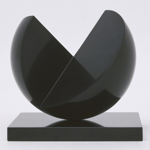
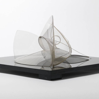
Anish Kapoor is one of my favourite artists. The first time that I saw his works was just after I did Body & Emptiness and thinking the way to convert it to a three-dimensional sculpture or installation. I had been deeply impacted by his sculptures, especially his Spire (2004), which looked really close to the shape that I used to plan for the three-dimensional form. At that moment, I felt there might be something similar on our ideas, but I did not continue to research him at that time. However, for this time, I want to see more his works and know more about him.

"Kapoor's interest in infinity, void, and endlessness is as much an interest in carving out space to consider meaning, as it is a reflection on the state of no-thing-ness, and a clearing of the mind. The colour black, like an abyss in the cosmos, signifies an opening for new and unpredictable experiences and presents limitless opportunity for self-development and contemplation."
"In this sense, Kapoor achieves a typical artist's goal, to unite metaphysical dualities including light and dark, earth and sky, mind and body, male and female, and in this case, painting and sculpture."
theartstory.org


Kapoor's thought is quite similar as the idea of Tai-Chi Diagram, both of them are talking about the duality. However, the later one also accentuates the complementarity and interchange between the opposite elements.

"The idea that if I empty out all the content and just make something that is an empty form, I don't empty out the content at all. The content is there in a way that is more surprising than if I tried to make a content."
ibid.
This quote touches me a lot because Kapoor uses a really plain way to describe something similar as the Buddhism's emptiness. The Buddhists tried to get the rid of all form so they even did not teach the "truth" in words because if they did, it would no longer be the truth anymore. So Kapoor's words also inspired me that if I want to create the duality of Yin and Yang, form and formless, I should not intentionally design a empty space that contains any content.

Naum Gabo

Naum Gabo was an important artist that associated with the Constructivism. His sculptures experimented the combination with physics and his work s did in1920s is considered as the first artwork of Kinetic Art.
The reason why I am interested in his works is because I found his sculptures had some similar ideas that I used to plan to make the three-dimensional form of my work. Same as Kapoor, Gabo's works were also talking about space and "what is unknown as well as what is known: with void as well as form." His ideas also inspired Max Bill who I am also interested in.
Spiral Theme (1941)


He was inspired by the shells when he was living in St. Ives. The structures and shapes are visually amusing which looks like a shell. What most inspired me is the material that he built this sculpture, which were cellulose acetate and perspex. I may research them later.
"Gabo's work incorporated or suggested what he called "kinetic rhythms", reminding the viewer of a quintessentially modern discovery first made by Albert Einstein, that time and space only exist in relation to each other."
theartstory.org
Linear Construction No. 2 (1970–1)

Gabo also used a really different material in this sculpture, nylon filament, which helped to express a "sense of immateriality" which he wanted to put in this sculpture. The exquisite lines create really elegant texture in this sculpture and the ring that was hanging the sculpture may also helped to pull the threads to build a better shape.
László Moholy-Nagy

"Moholy-Nagy believed that humanity could only defeat the fracturing experience of modernity - only feel whole again - if it harnessed the potential of new technologies. Artists should transform into designers, and through specialisation and experimentation find the means to answer humanity's needs."
theartstory.org
1. Photogram (1926)
2. Double Loop (1946)
3. Papmac (1943)


"Moholy-Nagy's interest in qualities of space, time, and light endured throughout his career and transcended the very different media he employed."
ibid.
"His experiments in light and shadow reinforced photography's value as a subjective medium, and therefore an artistic medium, rather than simply a means to document reality."
ibid.
In the Guggenheim's introduction of Moholy's works, I knew the materials that this artist used further, which were shaped Plexiglas and cellulose nitrate. Further I knew that the Plexiglas could be re-shaped under the high temperature, and it's also a little bit solvent-sensitive.
Summary
After studying these artists specifically, I am deeply inspired by their ideas, and interestingly they all considered about space and time. Meanwhile, I am really interested in the materials that used by Gabo and Moholy. In the next step, I will start to do some sketch of my ideas and research the suitable materials.
Research of the Development of Tai-Chi Diagram
On account of I did this work quite early, so at that time I had not had the habit of research. Most of the ideas were my original thoughts, which may not be that "academic". Therefore, while I was researching the art movement, I also began to look some articles about Tai-Chi Diagram's development and the relationship between Buddhism and Taoism.
The "Emptiness" In Buddhism and Taoism
Although both Buddhism and Taoism mentioned the "emptiness" in their philosophies, the meaning of it is different. The Taoist accentuated the duality of everything, therefore the emptiness is the opposite element of form, which is also a part of the nature. In the Buddhism, despite the emptiness is also mentioned alongside the form, it more cares about revealing the fact of this world, which the world is illusive. However, the Buddhism has become as a part of Chinese culture since Han Dynasty, so some of its ideas has already merged with indigenous religion, Taoism. In general, the emptiness in Buddhism is more absolute and ideal, while Taoist also emphassing the importance of form.
The Development of Tai-Chi Diagram
The idea of Tai-Chi had been conceived in the primal time, when ancient people painted the patterns like spiral that interplayed with each other. Then, Chinese people created He-Tu and Luo-Shu, two diagrams used to do divination, while Fu Hsi, an emperor of China that recorded in Chinese mythology created the Congenital Eight Trigram, which appeared the prototype of Tai-Chi Diagram. Until Zhou Dynasty, King Wen of Zhou developed Fu Hsi's diagram called Postnatal Eight Trigram based on the I Ching, which had already recorded the development from Tai-Chi to everything. Nearly two thousand years later, a scholar called Shao Yong organised fourteen Eight Trigrams which can show the further development of the philosophy of I Ching. At that time, the current Tai-Chi Diagram had not really been created, most of the diagrams were still based on the form of Eight Trigram. Until Southern Song Dynasty, another scholar, Zhang Xing-cheng who studied I Ching drew a Diagram that both had the original eight trigram as well as the pattern of Yin-Yang fish. In the Ming Dynasty, the Tai-Chi Diagram eventually became mature by the modification of scholars for generations. The scholar Zhao Hui-qian and Zhang Huang did the diagrams that almost same as the modern version.


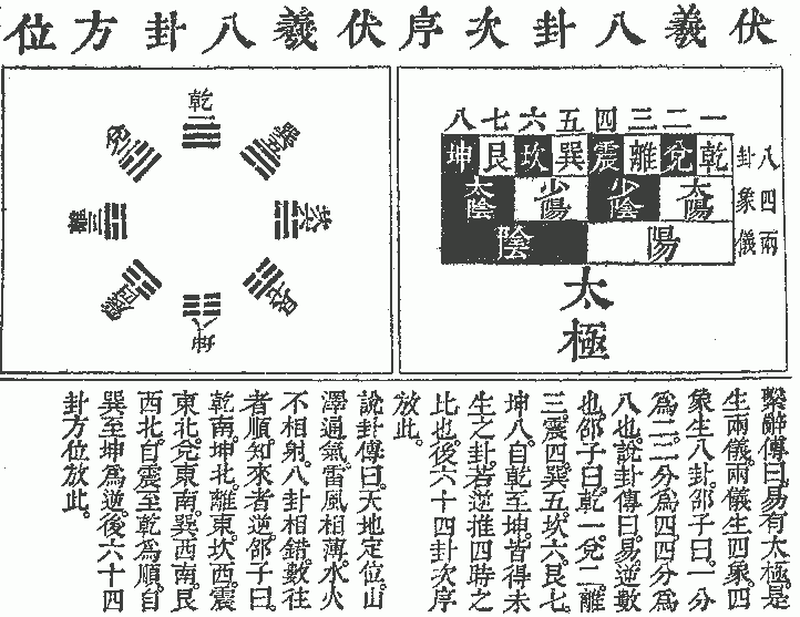


On account of I Ching was the culture that more belonged to Confucianism (actually I Ching influenced both thoughts), for Taoism, there was another route of development. In the Eastern Han Dynasty, the alchemist Wei Bo-yang drew a diagram of the water and fire against each other and a diagram of the five elements. Later at the beginning of Northern Song Dynasty, a Taoist master drew the Wu-Chi Diagram based on Wei's. Subsequently, another scholar Zhou Dun-yi who both studied Taoism and Confucianism created his Tai-Chi Diagram.


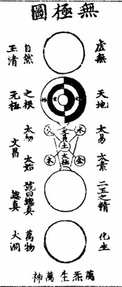


I am profoundly inspired by Zhou Dun-yi's The Theory of Tai-Chi Diagram, which he also used this picture to express his idea. At the top of this picture, the circle implies the idea that Tai-Chi, which means the chaos at the beginning of the universe, was coming from Wu-Chi, the emptiness. The second circle depicts the interplay of Yin and Yang, that they generate each other in the loop from movement to rest.
Then the third one is the relationships of five basic elements that produced by Yin and Yang. When the Yin-Yang fused with the five elements, things are separated into two major kinds and therefore comes out male and female. In the last circle, after everything has formed by Yin and Yang, they are all spontaneously entered in an endless circulation that changing constantly. (explain based on Lin Zhong-jun's article)
References:
1. About Tai-Chi Diagram:
Reflection of Zhou Dun-yi's Theory of Tai-Chi Diagram, Lin Zhong-jun, 2000, Study of Confucius No.1
The Evolution of Taoist Tai-Chi Diagram, Zhu Yu-zhou, 2008, Heilongjiang History No.5
Analysation of the Digitisation of Tai-Chi Diagram, Luo Yi-chong and Xu Liang, 2006, Social Sciences in Yunnan No.6
Reflection of The Taoist Connection of Zhou Dun-yi's Theory of Tai-Chi Diagram: Also About His Taoist Life Style, Chen Gu-ying, 2012, Philosophy Study No.2
Study of The Origin of Yin-Yang-Fish Tai-Chi Diagram: Also The Discussion of Guo Wen's Opinion, Zhang Qi-cheng, 1997, The Study of Zhou-yi No.1, General No.31
2. About the Comparison of Chinese religions:
The Similarities and Differences Among Confucianism, Taoism and Buddhism, Zhu Ji-ying and Lu Wei, 2003, Academic Journal of Harbin College Vol.24 No.7
The Relation of Confucianism, Buddhism and Taoism and The Development of Chinese Buddhism, Hong Xiu-ping, 2002, Journal of Nanjing University (Philosophy, Humanities and Social Sciences, Vol. 39 No.3, General No.147
3. About Chinese Buddhism:
The Shadow of "Emptiness": The Different Meanings of "Emptiness" in Buddhism and Taoism, Fan Xiao-li, 2008, Anhui Literature No.8
Sketch and Research of Materials

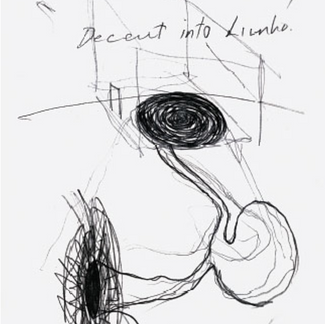
This image is exactly what I used to plan to present in my work three years ago, and I used the knowledge that I learned from Digital Design course to make this animation by Photoshop. The black and white are generating from each other and then disappear was the main idea for realising the work. Therefore, based on this point, I sought for some ways to embody it.
Virtual Reality
This first idea came into my mind is virtual reality, what I really wanted to learn and try on my works. The general idea was that to set an interact spot which can be triggered when the user touch the white wall. After the spot is launched, the user could see the white wall is gradually becoming black from that spot and then the whole world in the virtual reality glasses becomes dark, and then slowly a white point appear from where the spot was again and then repeat this order.
However, when I researched the method of designing virtual reality, I found that this could be a large job because it will take a long time to study and prepare. Eventually, I denied this idea.
Hologram Projector

While I was searching the virtual reality, I occasionally found an equipment called hologram projector which can project the image in the air by the rotation of this fan (actually just because we can hardly see the fan when it rapidly rotating). That looked quite amazing and visually striking. Nonetheless, it also had limitation on both the size and projecting method. The price of a hologram projector was quite expensive and it could not project in a size that larger than itself. Hence, I gave up this idea as well.
Then I decided to make a sculpture as what I wanted to do.


In 25th January, on the way to London, I came up with an idea of a sculpture like kaleidoscope, which represent the body and emptiness on two sides. This box will be made by mirror because that is something can reflect the real world. However, the most difficult part is the cone-shape area.


Glass
To make a mirror-like effect, the first material came into my mind was the glass, but obviously it was difficult to find a place to bespoke this cone and the glass was pretty heavy. However, if I can use this material with the mirrored-effectpaint that will be awesome.
Polished Metal
By the inspiration of Anish Kapoor's Spire, I thought the polished metal can also achieve this effect. However, it was still hard to make a metal one because I should not only prepare a mould but also the metal would probably cost a lot.
Fibre Glass
Inspired by Kapoor's another art piece, When I Am Pregnant, the fibre glass that he used is also a good material that lighter than normal glass. After watching the videos, I found using fibre glass also requires a mould as well as a complex process; meanwhile, I should consider how to create mirrored effect on this material as well.
Perspex and Plexiglas

Perspex and plexiglas are the same material but produced by different companies. It is a kind of translucent acrylic which is easy to be shaped by high temperature. Both Naum Gabo and Moholy-Nagy used this material to make sculpture. Moreover, I found there is a kind of mirrored acrylic in the market which may have a similar property as perspex.
What's more, I found there is a mirror effect spray that can make the glass looks like a mirror, so I thought that it could also work on the plastic.
However, after contacting several plastic company, they all could not provide this service because as a technician told me that it requires a vacuum machine to shape the form , maybe it only accept for large amount order.
Cellulose Nitrate
I thought it might be too difficult to handle, so next one.
Iron Wire
It is an easier material to handle because I can easily shape the structure. But the difficulty was it's hard to make the mirror effect. I used to plan to use the iron wire and the light to make an installation.

Plaster
The last idea was using a mould and a square box to make a plaster sculpture.


However, the difficulty is still existing on the mould making process. I used the clay to shape a mini example of the mould but the effect is not that good. I think to make a perfect shaped mould really need a pottery wheel.
Summary
To sum up, comparing to all these materials, I found only the perspex and plexiglas met with my expectation. There are two options that probably can achieve the effect that I want. The first one is using the mirrored plastic to directly make a cone and the second choice is make a cone first and then use the mirror effect spray to let it looks like a mirror. Therefore, in the next step, I will experiment these two materials and see the result of it.
Travel to London

In 25th January, we went to London to see some exhibitions. The first gallery we visited is Wellcome Collection. During the Christmas holiday, I had come to see the architecture exhibition which displayed at the ground floor.

Medical Now

The first exhibit I visited is "Medical now" and there was a cabinet storing different types of pigment which was really attractive. The pigments were made by minerals and the colour were so vibrant. The bottles that laid in it also reminded me the one in Poole Museum. The composition of displaying spontaneously formed structures.


1. Mauro Perucchetti (British), Jelly Baby 3, 2004, polyurethane 9 of 9
2. Jon Isaacs (British), I Can't Help The Way I feel, 2003
3. (not sure the name)
4. Annie Cattrell (Scottish), SENSE, 2001-03
5. Luke Jrram (British), Swine Flu, 2009, edition 1 of 5, blown glass
6. Chris Drury (British), Rockies/ Karakoram, 2003, woven maps and printed echocardiogram

I was amazed by the artworks because the artists applied some many different materials to make the body or something biological thing such beautiful.
These artworks demonstrated the wonderful structure of the nature and also reflected some social issues such as obesity and virus.
Medicine Man

This exhibition shows the collection of sir Henry Wellcome. There were many fantastic stuff that I never seen before from all over the world were exhibiting.


I really like the glasswares that were in the show because they all have really nice shape. As for the first one, it inspired me to search the blown glass company .
British Museum
In the afternoon, we went to the British Museum which almost contains a brief wold history. We took over 2 hours to roughly view the museum, and what attracted me most was the Japan gallery.


The Japanese crafts had a strong attraction to me because they looked so exquisite and perfectly combined natural and technical content together.
Inspiration

Half month later, when I found both glass and plastic were difficult to bespoke the shape the I expected, and remembered an object that I saw in the museum. It probably a saddle that made by bamboo weaving and enchased with mother-of-pearl inlay. Suddenly, I got the idea of using the bamboo cane because it could be strong and flexible enough to hold the shape comparing to iron wire or simply thread.
However, after I searched the bamboo cane on Amazon, the delivery would takes a long time, so I decided to change the material to wood reed.
Plan of Outcome


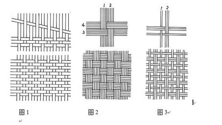
On account of this was my first time to do the weaving, I was not really sure how to make the exact shape that I want. So I drew several plans based on my imagination and then watched some videos about introducing bamboo-weaving as well as some actual artifacts.


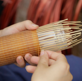


These photographs inspired me the variety of weaving patterns. For example, the first bamboo-weaving ware has an arrow-shape design on the edge of the reed which can help the transition from the wider one to the thiner one looks more natural. Meanwhile, the craftsman in the third picture was making the artifacts that looks pretty like what I am expecting so how he made it is really beneficial for me.
This video taught me how to deal with the rough reed; nonetheless, I do not have any materials that can help me to refine my reed.
Shopping List

The planning budget was within 200 pounds. For the secondary research part, I bought 2 pieces of perspex sheets (one was clear and another was mirrored). For the outc ome, I bought a quite thick thread
because the radius of the cone was long, but it would be better to use one continual thread to complete the whole. For the frame part, I bought three different widths' reeds to fit the shape better and the thick nylon thread to help the cone be held on the wall. The most costly respect was the paint and the brush. For creating a smoother surface, I searched the recommendations of soft brush online and found neptune's. However, the price of it was quite expensive, so I found Jacksons' brush was a better choice for me.
In addition, after I received the twine and decided the final draft of the cone, I found that the twine was quite rough with many excessive hairs. Therefore I researched the way to solve this problem and bought olive oil, lighter, and beeswax. This process will be mentioned later.
Experiments
1) The experiment of perspex
[Perspex experiment]
2) The experiment of weaving


Therefore, I also looked up some weaving methods and experimented them with thread.
[Need a picture of experiment]
3) The experiment of acrylic
Back to the origin of my idea, I want to create a contrast between reality and unreality. Hence, I plan to leave the external side of this cone in its natural colour and shape, and paint black inside, which corresponding to the Yin and Yang. With inspiring by the vantablack that Used by Anish Kapoor, I think that would be a fabulous choice for me. However, after I searched online, I found it could only be used by Anish Kapoor himself for artwork.


Interestingly, I found in the angry voice of protesting Kapoor's action, there was an artist Stuart Semple led his team produced the pinkest pink and the darkest acrylic paint to against Kapoor. Although the black acrylic paint is still progressing (currently is Black 2.0), the effect is already quite good. Therefore, I purchased some to paint the inside face of the cone and also bought a little bottle of reflective paint to test my another idea, which is to paint the reflective paint on the attaching surface of the smaller hole. However, there are some aspects still needs to experiment. Firstly, would the protective mattifying membrane obviously effect the black colour. Secondly, whether the reflective paint would effect the black colour.


Therefore, I did a comparison experiment to test the effects of different combinations. I set up a control group which only painted the black acrylic and other four groups that painted by different strategies. For the black acrylic and the reflective coat, I painted third times and each time was painted after the previous layer had drought.

Final Draft

Research of reducing the excessive hairs on twine

After I received the twine, I found that there were many rough hairs on it. I tried to paint some acrylic on it but the effect was not good enough with these hairs. Hence, I searched online about the methods of removing them.


There were mainly two steps to enhance the quality of the twine. Firstly, it need be slightly burned by fire until the hairs become as ash. There was a pretty regretful mistake occurred, which is I did not buy the kitchen lighter, but using the normal lighter that really needed big strength to turn it on. The lighter was easy to burn the finger so that I wore double gloves on the right hand and also applied vaseline on the thumb. Meanwhile, there was an health and safety tip, that we should do this task outdoor or in the ventilated space, and it was better to wear a mask to prevent inhaling the smoke.


Secondly, we can brush some plant oil, such as olive oil, on the surface of it and let it dry in shadow for a day. Moreover, we can mix 20% beeswax with 80% oil to make the twine stronger. I used both the heat gun and microwave to melt the wax.
Making Process
I firstly used the frame that built with cane and nylon thread, but the nylon was too soft so I changed it to iron wire. However, the disappointing thing is that the twine itself was too loose to held the shape and in the afternoon of March 1st, the last working day in studio before presentation, all the staff had been off the duty so I could not find any more glue to remedy it. Therefore, I had to change this work into another form, which I bent the iron wire and made it looks like a flower.
I was so depressive at that moment, because all my effort had been in vain.

However, when I looked back to what I had done, Richard Tuttle's words caught my eyes, he said, "well, what about making drawings about the area that you can't see?". I did not want to totally give up this project, so I thought another way to express my idea based on the primary idea, though it could not be as effective as it.


I used the black paint to paint several layers on the wall to achieve the best black effect and also covered it with a protective paint to make it looks more matt. Then I glued a circular mirror plastic in the middle of this circle, interestingly the contrast between these two items were really effective. in the camera, the black paint showed a pitch black colour and the mirror reflected the light and caused the brightness of it looks quite unreal. However, on account of the reflective paint had not arrived, so I had not put the final effect at here yet.
Evaluation
I am always keen on trying different materials, art forms and elements; hence, in the structure project, I want to explore further the sculpture based on the last Dada project. The previous time what I did was a ready-made sculpture. This time I would like to try something that needs more hand work. This project is derived from photographs that I took several years ago, which attempted to reflect my opinion about the connection between a Tai-Chi diagram and Buddhist philosophy.
Compared to last time, I put more effort into the primary research, so I saw some exhibitions and videos, and noted down the points that might be helpful for the project. Meanwhile, I researched the development of abstract art and tried to find some artworks and artists that inspired me. I studied the work of Anish Kapoor, László Moholy-Nagy, and Naum Gabo specifically. From their artworks, I was inspired by the materials and ideas in the art pieces. I think this was new progress in my research method, which was also the part that I most enjoyed. However, the selection of material was the most challenging aspect of this project, and I experienced difficult moments because I could not find any place to buy the proper material, so I had to change my plan from time to time. I considered nine materials from the beginning to the end. Therefore, the disappointing truth is that I did not use plastic or glass, which were the materials in the original plan. , I had to concede again and again until I found the twine and cane did not work well in the last few days before the deadline. Thus, I learned that I needed to keep at least a week in the end in case there was an accident.
From this project, the most impressive moment that I experienced was the feeling of failing, because I found all my preparations that had been made for the weaving did not work as well as I expected. It was the most depressing time that I ever had in the afternoon of the final Friday before handing in the project. The staff had finished for the day and I did not have enough glue to rescue my weaving and could not even carry it home because it was too big. I would not say it was unfortunate, though I exhausted myself by working two full days to prepare the twine. , This situation was caused because I did not plan wisely. So I need to improve my time management, and I should consider each decision rationally even though the time was limited.
Although I could not realize my sculpture work this time, I still want to try my best to present the progress compared to the old one. Therefore, based on my initial idea, I painted a two-dimensional version on the wall and used the title “From 0.001m to 100000000m, what can you see?” and used a torch to help the viewer interact with the painting. However, this urgent remedy for the project was still not effectively expressing my thoughts. Next time, I should pay equal or more time to the actual experiments and practice because the difficulties occurring on this part will take me a long time to solve. To sum up, even though the development of this project was not as successful as last time, it taught me a lot about how to prevent real problems.
Referring to the presentation, I am quite satisfied with the powerpoint because it showed my idea effectively. Nonetheless, perhaps due to I was the first one to present, I was quite nervous and did not speak really clear and fluent, which is the point that i need to improve next time. Fortunately, my presentation was finished within 5 minutes, and I was glad to hear the feedback from the classmates, that my efforts did not waste.


Comments